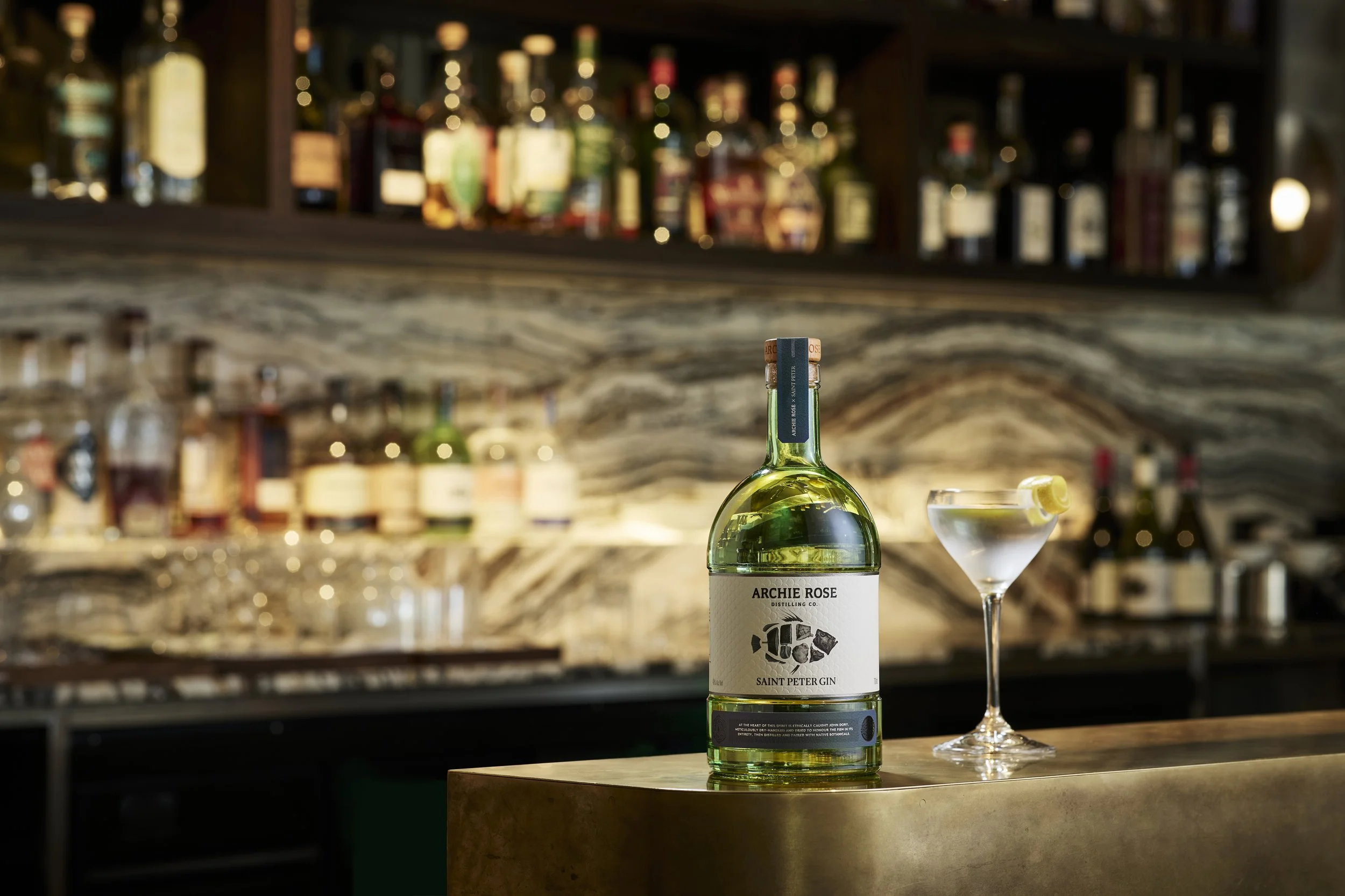
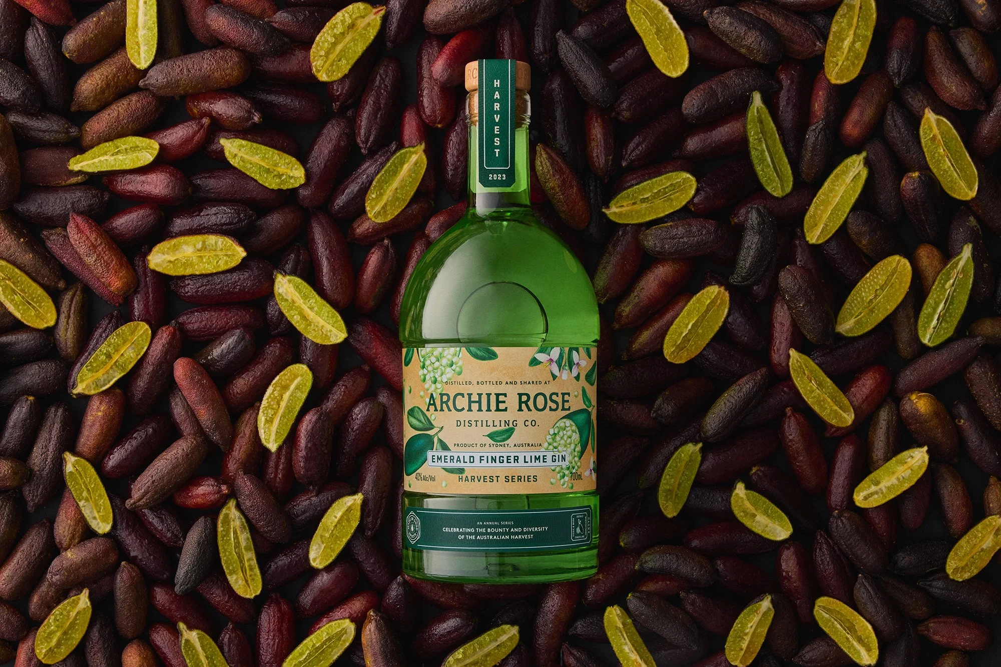
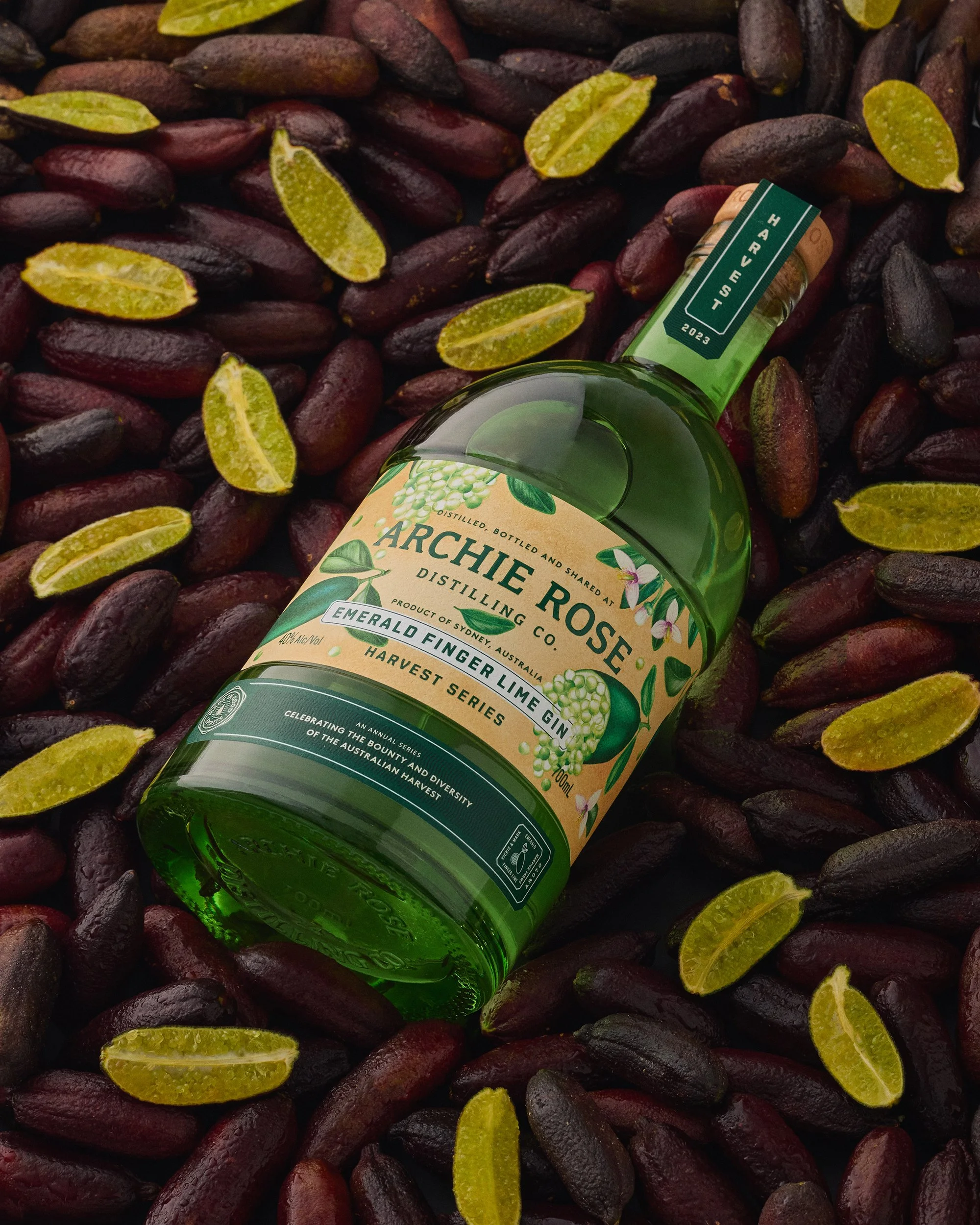
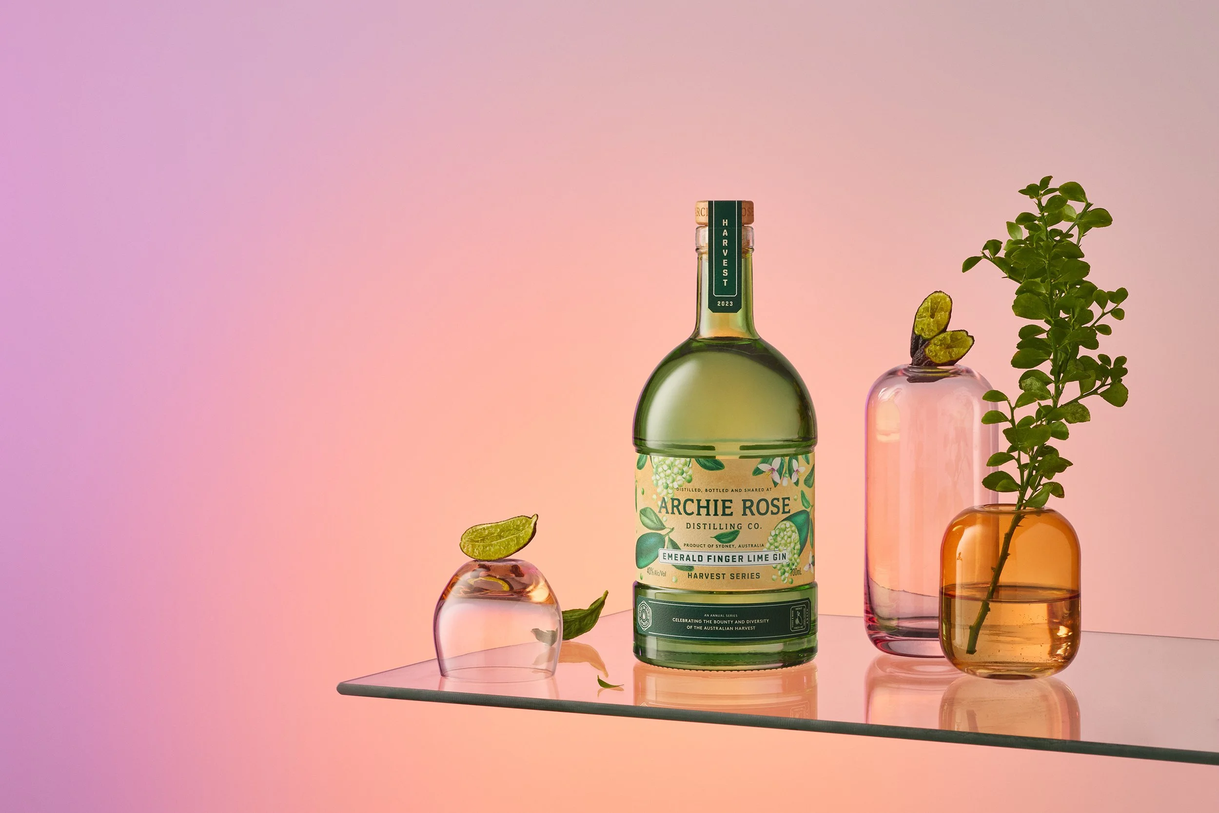
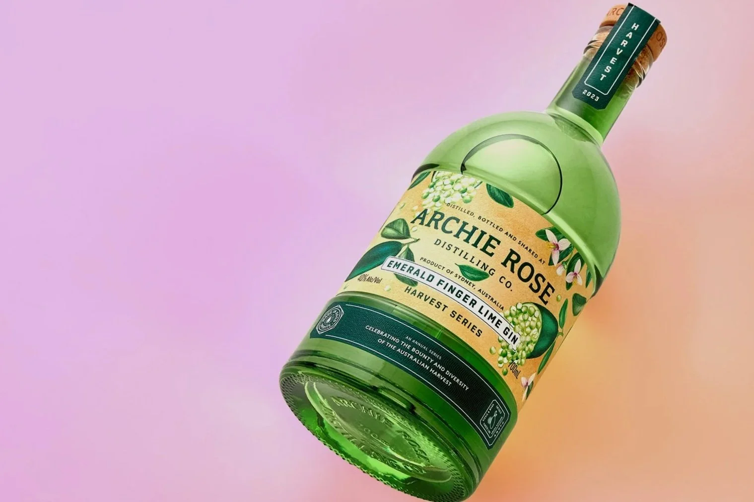
I really enjoyed working on this very unique, highly collaborative project by Archie Rose x Saint Peter.
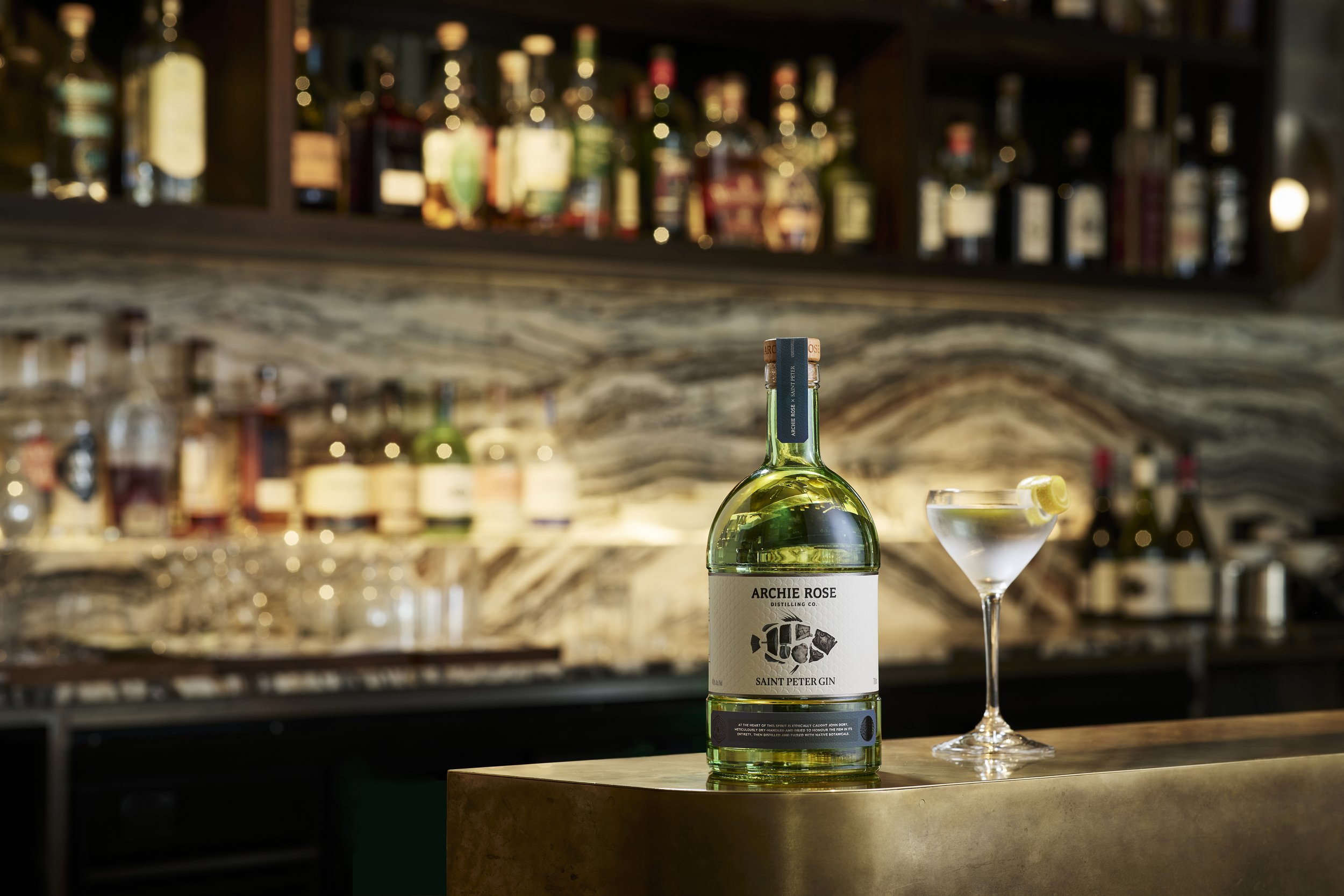
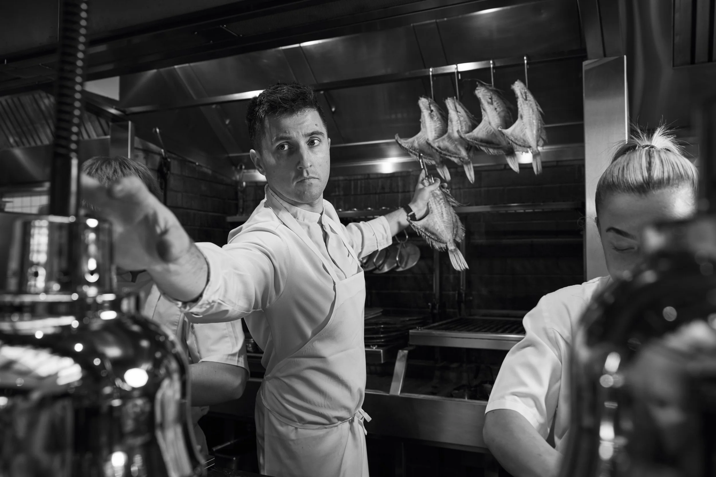
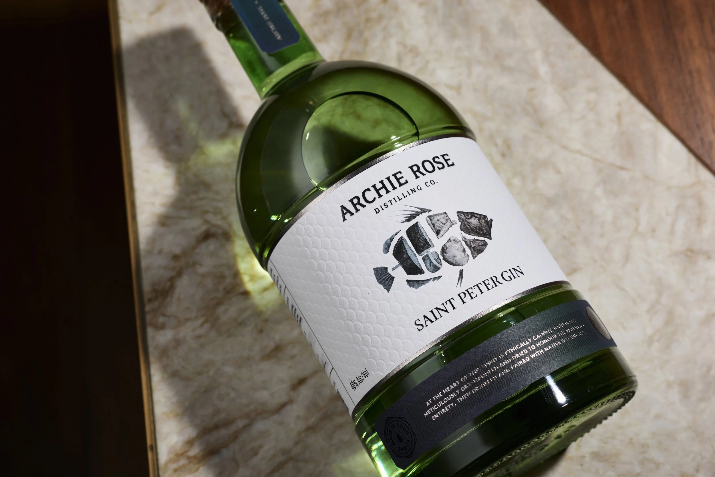
Chef Josh Niland and Samuel Cocks of Saint Peter and our awesome team at Archie Rose created a one of kind gin that reflects our shared commitment to provenance, integrity, and locally sourced ingredients, as well as a dedication to bold flavour without waste.
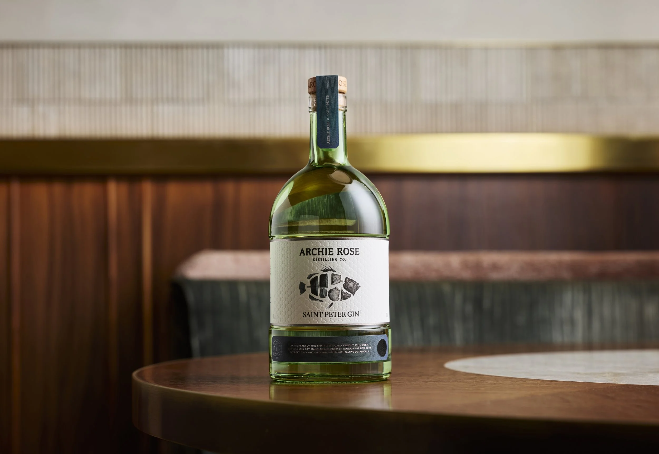
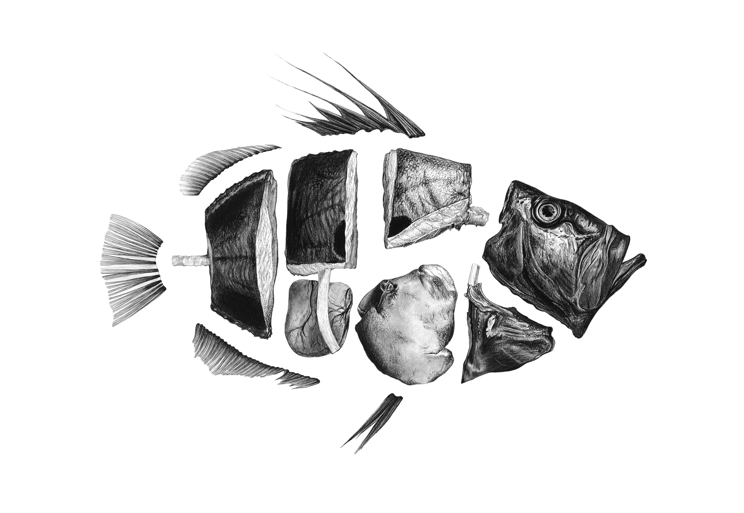
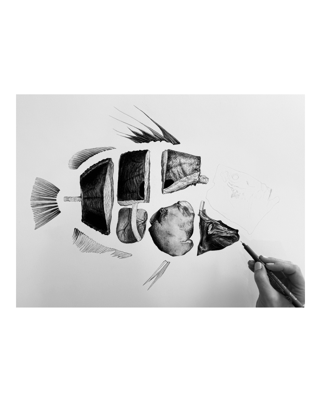
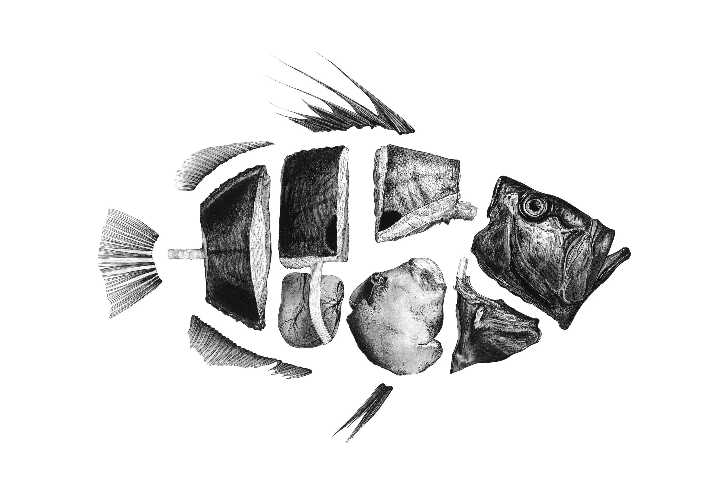
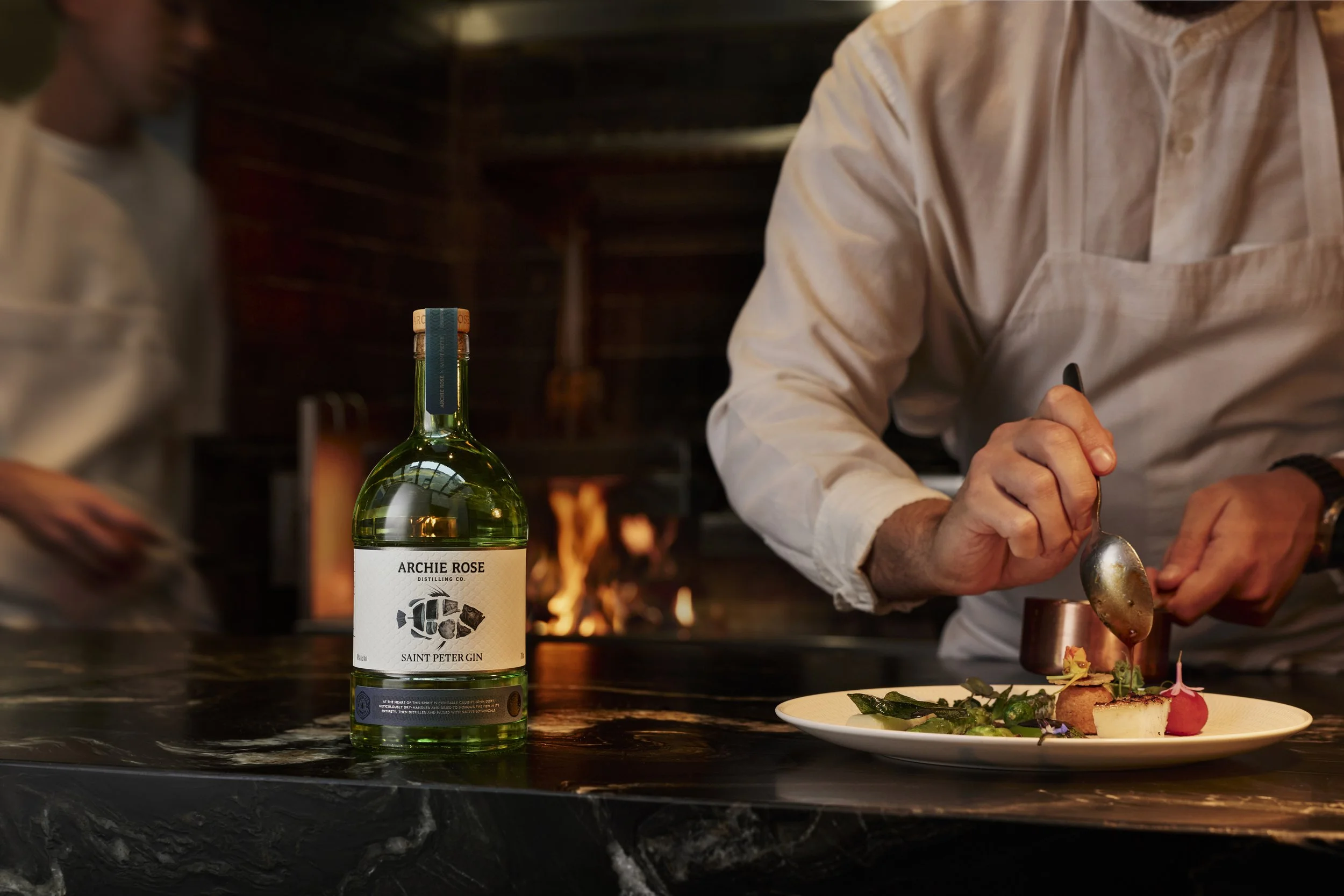
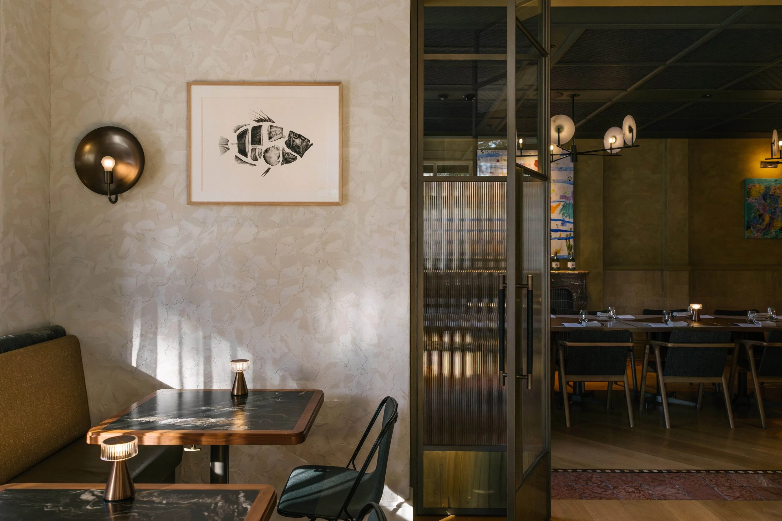
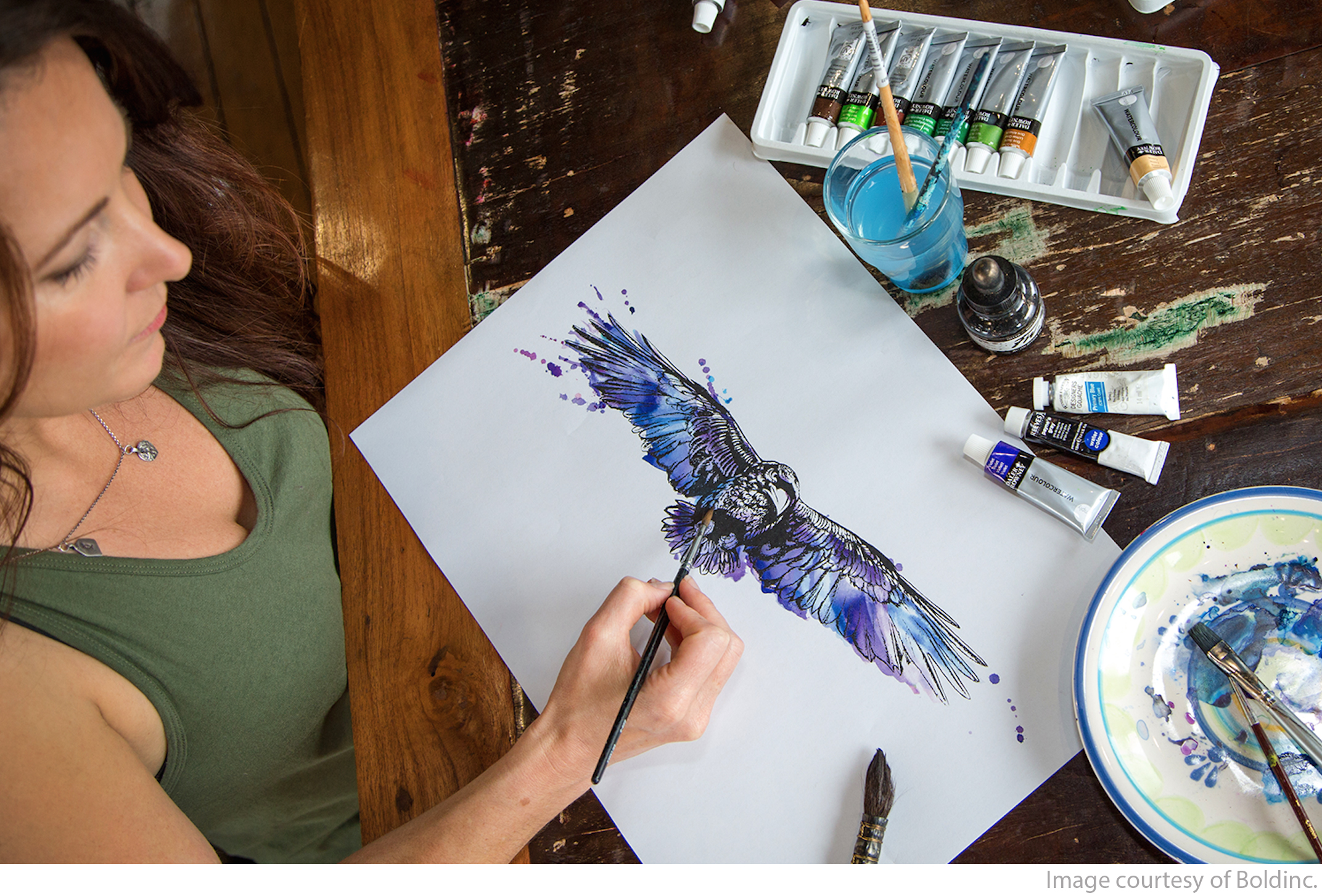
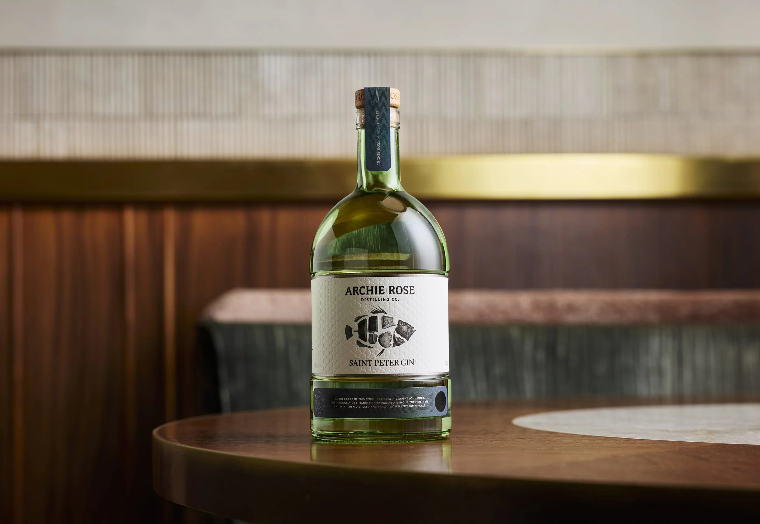
It was a true pleasure to design and illustrate this label. The concept centered on heroing the key ingredient—the John Dory—through a hyper-realistic anatomical illustration, highlighting the “nose-to-tail” sustainability and zero-waste philosophy embraced by Saint Peter and Archie Rose. The artwork is life size and illustrated using ink and charcoal. It is inspired by Rob Palmer’s stunning fish photography, which is incredible and highlights both his and Josh’s precision and artistry.
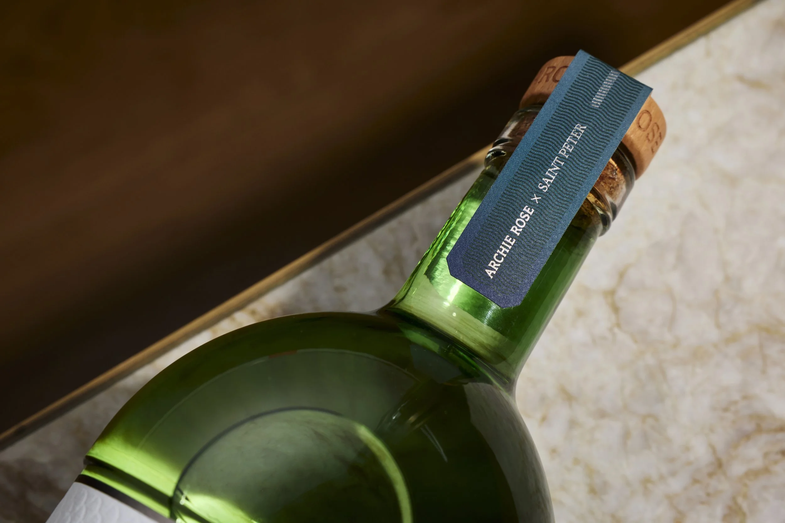
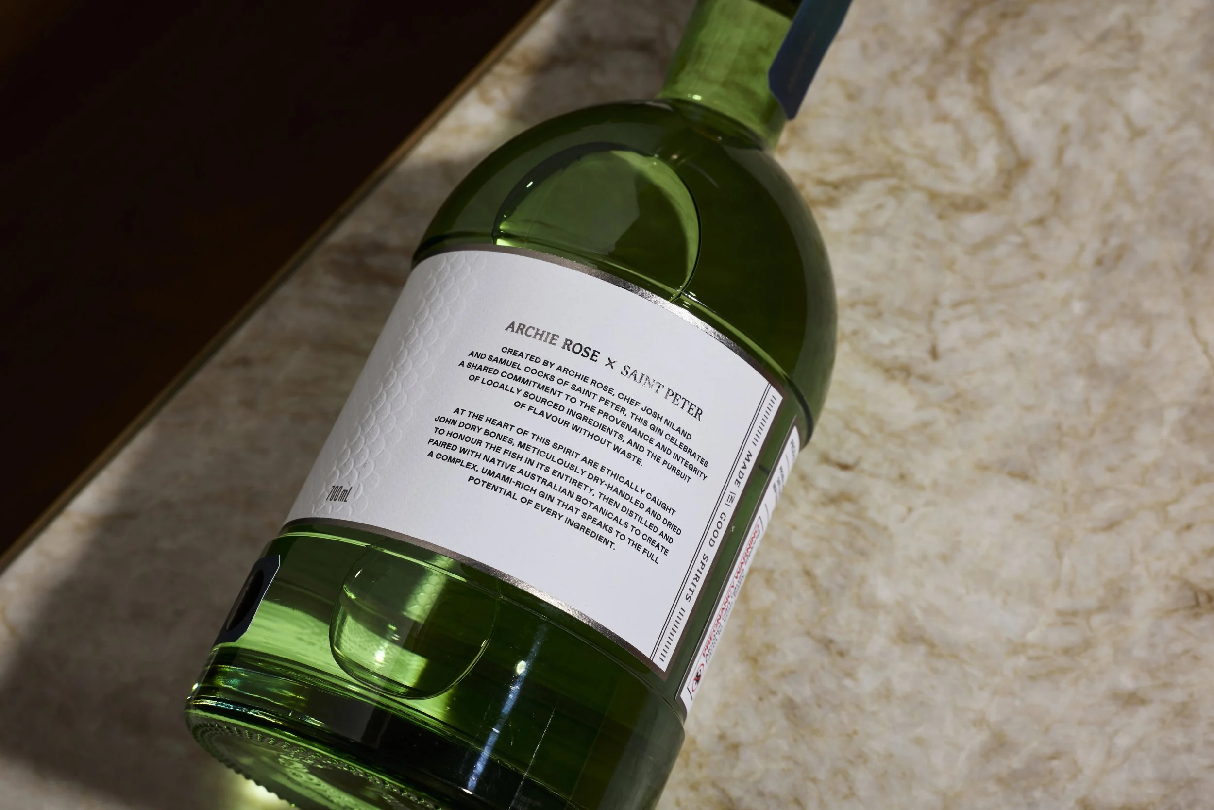
It’s not that often a fish scale emboss is the perfect print texture for a gin label but it felt right for this project. All the print embellishments were chosen to give the label an understated elegance, the touches of platinum foil catch the light and refract colour like fish scales do.
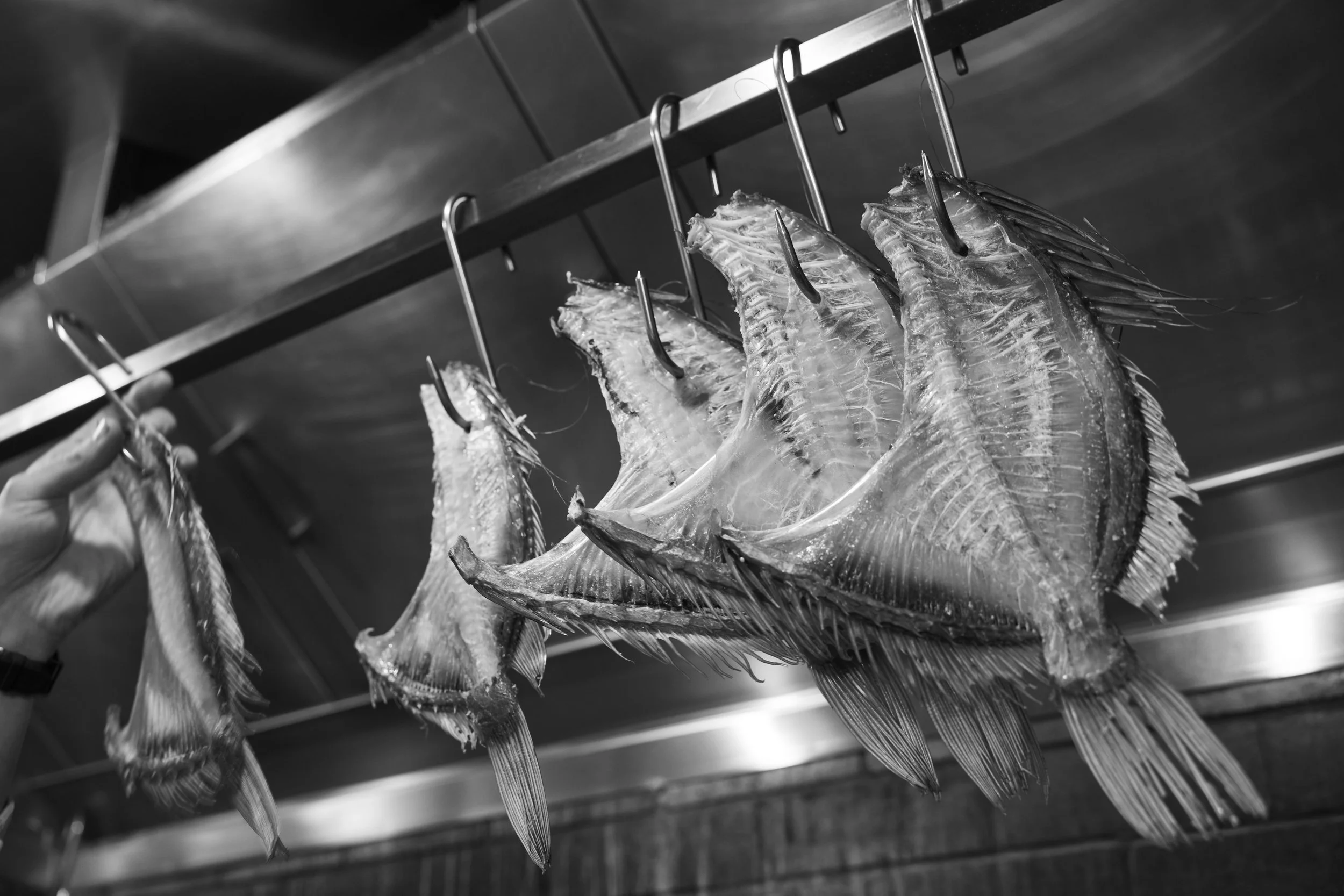
The liquid - At the heart of this spirit is ethically caught John Dory, meticulously dry-handled and dried to honour the fish in its entirety - a process unique to Saint Peter - with the bones then distilled by the Archie Rose team and paired with local and native Australian botanicals including sunrise lime, celery, sea lettuce and green Kampot pepper grown in Mullumbimby, NSW. The result is a complex, umami-rich gin that speaks to the potential of every ingredient.